
This week, we’re taking a closer look at what sensitivity mapping is, how it’s used, and why it’s so important. A snapshot of the resources in a specific area, sensitivity mapping can be a valuable tool both in and out of the spill response community. In this latest blog, learn more about where sensitivity mapping first got its start, and how mapping specialist Jill Petersen has seen it grow throughout her career.
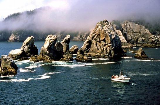
NOAA’s Office of Response and Restoration uses sensitivity mapping in a variety of ways, and creates Environmental Sensitivity Index (ESI) maps as a way for responders to get a snapshot of the resources in specific areas to better determine what risk oil and other hazardous materials might pose to them.
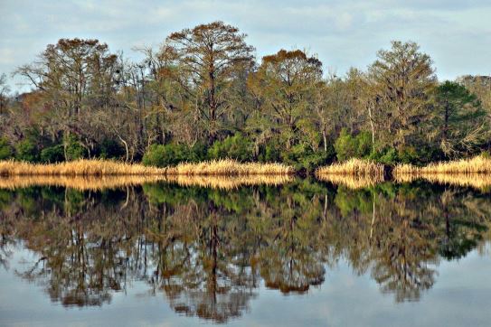
ESI maps provide a comprehensive look of at-risk resources, including biological resources (such as birds and shellfish beds), sensitive shorelines (such as marshes and tidal flats), and human-use resources (such as public beaches and parks). Today, these maps are available in a geographic information system (GIS) format that allows for a wide range of data to be incorporated into the maps.
But that wasn’t always the case. Overall, ESI maps have maintained a pretty similar look and feel, despite the fact that the earliest maps were hard copy only — with hand drawn shorelines and printed on irregular page sizes that made them difficult to copy.
A Need For Sensitivity Mapping Arises
ESI maps have been an integral component of oil spill contingency planning and response since 1979, when the first ESI maps were prepared days in advance of the arrival of the oil slicks from the IXTOC I well blowout in the Gulf of Mexico.
“The IXTOC well blowout was an ongoing situation, and that was when the reality of having resources at risk in front of you became an obvious need” said Jill Petersen, former ESI Program manager.
Jill Petersen had been at NOAA since 1988, initially working as a programmer with hazardous material response and planning tools such as the CAMEO® software suite. Working on the air hazard modeling program ALOHA® was how Jill first started making the shift into the world of mapping. Jill became a part of the ESI mapping process right as the first ESI map was published in a GIS format.
Using her computer science and programming background, she first began working on ESI — developing a lot of ESI tools to make things easier for end users — allowing them to query and create maps specific to their purposes.
“The older ones obviously didn’t have the level of detail that the current ESIs have, because it just wasn’t possible to manually portray all the information that we have now,” Jill said.
After the IXTOC well blowout, the ESI program and the earliest ESIs were created. Since then, the entire United States, including all its territories, has been mapped at least once. Aside from the Great Lakes, every coastal area has also been done in a GIS format — with the Maine shoreline being one of the most recent to be completed shortly after Hurricane Sandy in 2012.
Growing Sensitivity Mapping, One Species at a Times
With each iteration of the maps, the number of species included in the data has grown extensively.
“In Maine, for the same area, we maybe had 40 species mapped in the earlier version. In the new one it’s probably closer to 240 species mapped,” Jill said. “The volume of data and the content has changed considerably because now we have the monthly seasonality, the breeding activities, the concentrations, all this data we didn’t have before. … Now with the GIS format, there’s a way to store and keep that information, versus just the hard copy map.”

The creation of new ESI maps is a widespread effort that relies on a variety of subject matter experts and partners to collect all the necessary data. NOAA compiles a base shoreline by identifying the best shoreline available for the region; often this requires merging multiple shorelines within a single state. The classified shoreline is NOAA’s original content to contribute and acts as a base layer for inputting new data. Shoreline types are classified using a combination of oblique aerial photography, satellite imagery, low altitude overflights, and ground truthing.
“But all of the human use and biology data are collected from a wide, wide variety of data experts, a lot of federal agencies, state agencies, and academia,” Jill said. “For instance, I think a common number of data sources for an ESI atlas is often well over 200.”
Scientific support coordinators from OR&R’s Emergency Response Division are also instrumental in helping to identify the appropriate data experts for their region — often connecting to a larger network of experts to contribute useful data.
A Network of Experts to Support Spill Response
ESI maps provide more than just a common shoreline and data about the various species that live in a specific area. They also act as a resource guide that connects responders to the many experts that go into sensitivity mapping.
“ESIs are used for a first assessment, if a spill is ongoing, then the ESI itself becomes less relevant. The responders then need to be going back to those experts to confirm that ‘yes, in fact, these birds are currently migrating.’ They’ll be the ones who will know if there’s something they’re doing differently that season, if their range has expanded or diminished,” Jill said, adding that there will always be a need for responders to reconnect with the subject matter experts to verify the data is still up to date and valid.
“We have a lot of ESIs that are quite old, but they still have utility; the resource expert information is still there, and even if the person who provided that information isn’t, the position and the agency that provided the information likely is,” Jill said.


Looking Ahead
As Jill Petersen enters into retirement, the future of ESI maps remains uncertain — though partners in the effort remain involved in finding ways to improve the ease of use for ESI maps.
One of the contractors from the ESI project is currently developing an ESI toolbox that will be available early in 2020. The toolbox has similar functionality to several tools Jill developed in earlier versions of the maps — allowing users to create simpler complex queries and extract subsets of the data, as well as create maps that replicate the current ESI atlases. As some changes were made to the database post-Sandy, the new toolbox will work on digital data both old and new.

“I think the impact these tools will have is going to be significant and it’ll make things so much easier for end users,” Jill said. “I’m sad to be leaving before this new toolbox goes live, but I do still have visions for its success and that the Coast Guard and other users in the spill response and academic communities will find it useful.”
Whatever the future of ESIs looks like, Jill said, their value can’t be overstated.
“The most significant thing about them [ESI maps] is that they offer a snapshot of all resources in one place. Without an ESI, people would basically have to go through the whole ESI process in their mind to determine resources relevant to the region, and what data they need. With the ESI, it’s like one stop shopping,” Jill said. “I think that is really significant, having that right at your fingertips when it’s most needed.”